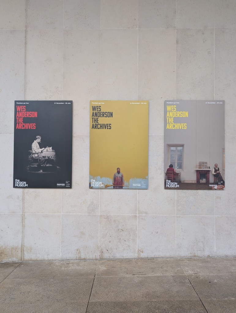
When I heard that The Design Museum in London was going to be opening a revised version of the Wes Anderson: Archives exhibition after its run at the Cinematheque in Paris, that I had seen highlights of all over my social media pages, I knew I had to go. I have been a fan of Wes Anderson’s work for a very long time and the chance to see so many archival pieces from all of his movies and beyond was not an opportunity I was going to pass on.
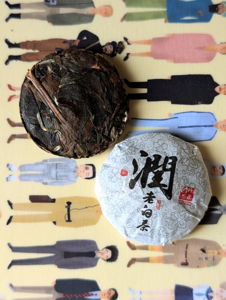
When it came to picking a tea to pair with this exhibition like I did for my visit to the National Galleries – Radical Harmony Exhibition, I wanted a tea that would fit seamlessly into any of films and stories within the exhibition, that wouldn’t seem out of place if any of the characters were sipping on it within a scene.
Of course I again chose to use my Teapro – On The Go infuser flask, and the tea I picked was Teapro’s Shou Mei Mini Cakes, a tea produced using the leaves of the Xiao Bai tea tree, with an intense honey aroma, rich mellow flavour and fantastic smoothness that I could undoubtedly envision many of Anderson’s characters sipping on. Plus, aesthetically the wrappers of each cake would fit seamlessly into The Isle of Dogs.
This landmark exhibition charts the evolution of Wes Anderson’s films from early experiments in the 1990s to recent productions, as well as collaborations with key long-standing creative partners. In order to bring this exhibition together, the Design Museum was granted unprecedented access to Wes Anderson’s personal archives, which the filmmaker has built up over three decades, with this being the first time most of these objects have been seen in the UK.
Anderson’s unique vision and dedication to detail has resulted in some of the most visually and emotionally compelling films of recent times, with this exhibition containing over 700 objects that evidence those results for all to see. It is a showcase of his meticulous craft in filmmaking, with insight into how the stories are built and brought to life, starting with original storyboards, polaroid’s, sketches, paintings, handwritten notebooks, puppets, miniature models, dozens of screen-worn costumes & more on display.
The exhibition moves in chronological order from Bottle Rocket, through to The Phoenician Scheme and covers every other film in-between, and I for one adore the choice to have the exhibition laid out in such a way, not only because it was incredibly satisfying for my neurodivergent brain, but also because it truly allowed you to see how he continuously honed his craft and developed his trademark style with each film released.
As I have done with other exhibitions I’ve covered, I’m going to split this post into sections and discuss my personal highlights from each section of the exhibition as opposed to trying to cover everything, as to allow you to still be surprised by elements of the exhibition should you decide to visit before it closes in August.
Opening Section/Bottle Rocket
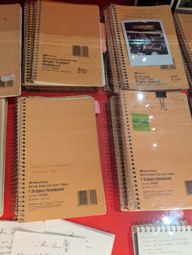
These two sections were the smallest of the exhibition hence my choice to combine them. Upon entering the first thing I was immediately drawn to was a cabinet filled with stack upon stacks of single subject note books, within which were the ideas each and every film within this exhibition were born and progressed within.
While they were not all open, the ones that were were so interesting to read though and with on-set polaroids above them tying everything together, it was undoubtedly the perfect way to begin this wonderful exhibition and gave you a taste of what to expect.
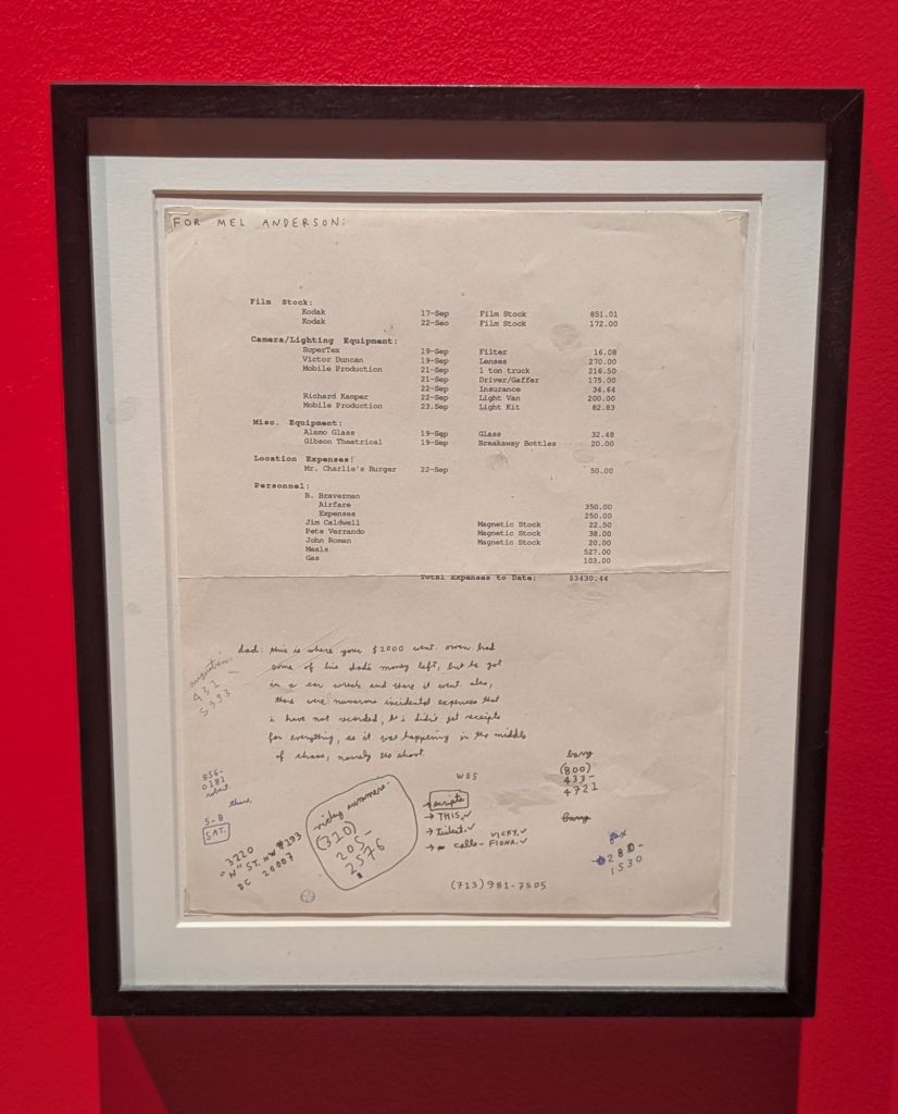
Moving onto the Bottle Rocket section, my favourite piece within it was the hand annotated budget sheet, because it shows you just how little of a budget they had to work with and that despite that, they still manage to bring the film to fruition. I’m always endlessly intrigued by little behind the scenes documents like this and the way in which many would be filed away, never to see the light of day, and in spite of how mundane they may seem to a wider audience.
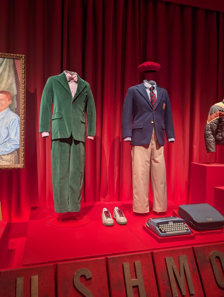
Rushmore
While Moonrise Kingdom is undoubtedly my favourite of Anderson’s films, Rushmore comes a very close second. Because of this, this section marks the first time that this exhibition made me emotional and it would definitely not be the last.
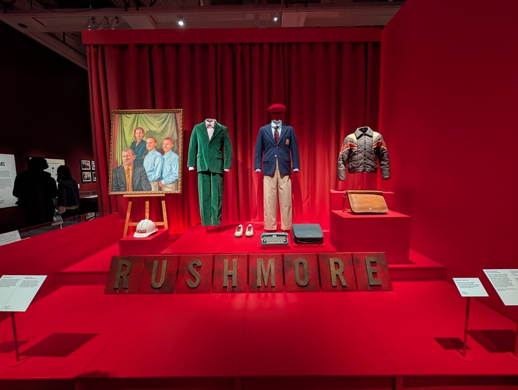
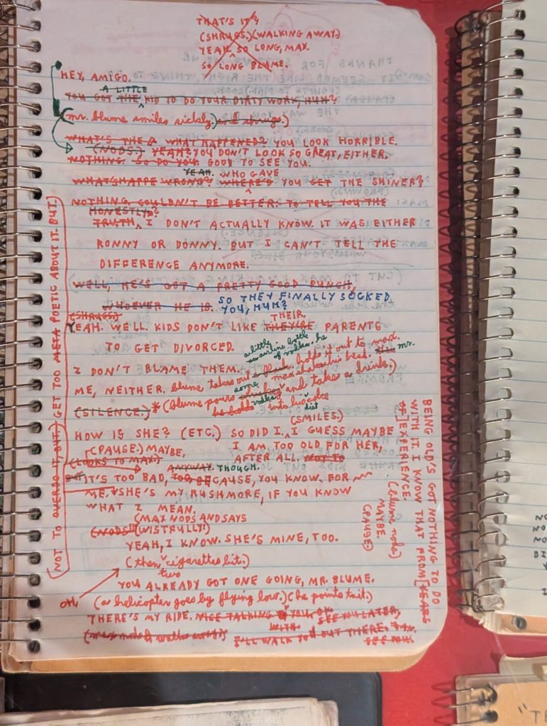
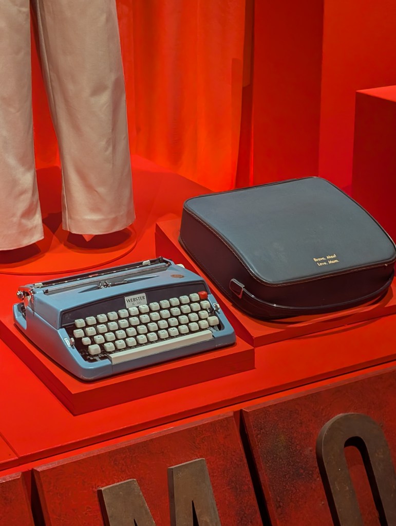
This section greets you with a bang from the moment you turn the corner from the entrance / Bottle Rocket, immediately showcasing two of Max’s iconic outfits, red beret, jacket and even his typewriter & case, alongside the letter tiles featured on the gates of the school that spell out Rushmore.
That alone for this section would have been mind blowing for me and those iconic pieces were certainly my highlight from this section, but there’s so much more beyond that, such as Max’s pocket knife, Rushmore yearbooks, hand annotated scripts, play programs and so much more that I could talk endlessly about, but I will hold back so you are left surprised should you visit the exhibition yourself after reading this.
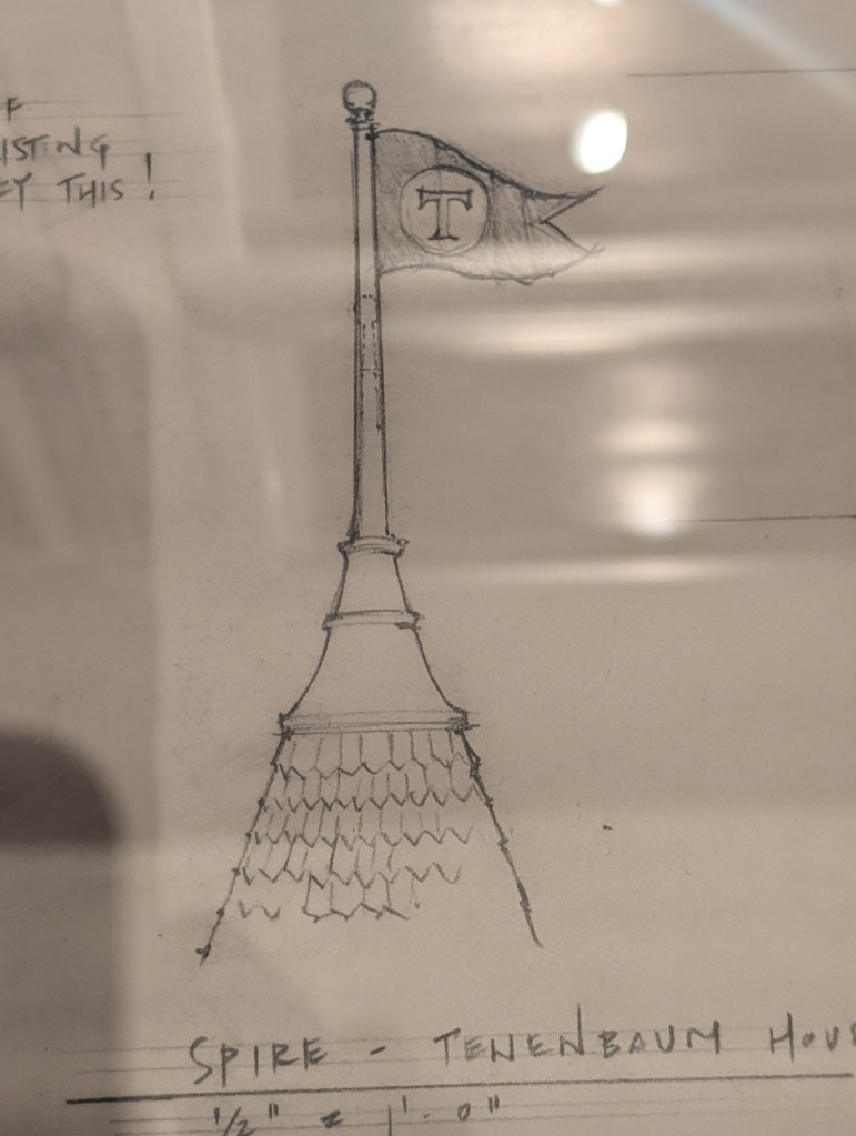
The Royal Tenenbaums
My highlights from this section if I was pushed to pick out of everything are all paper based, and they are the design sketches for the Tenenbaums house & the iconic spire with the “T” flag. While it was obviously a dream come true to see the outfits from the movie, especially Margot’s coat and other props, there was just something so special about these sketches and as an art lover, seeing how these key elements start off as sketches and later materialise is fascinating & just really proves how important artists & designers are to the film industry.
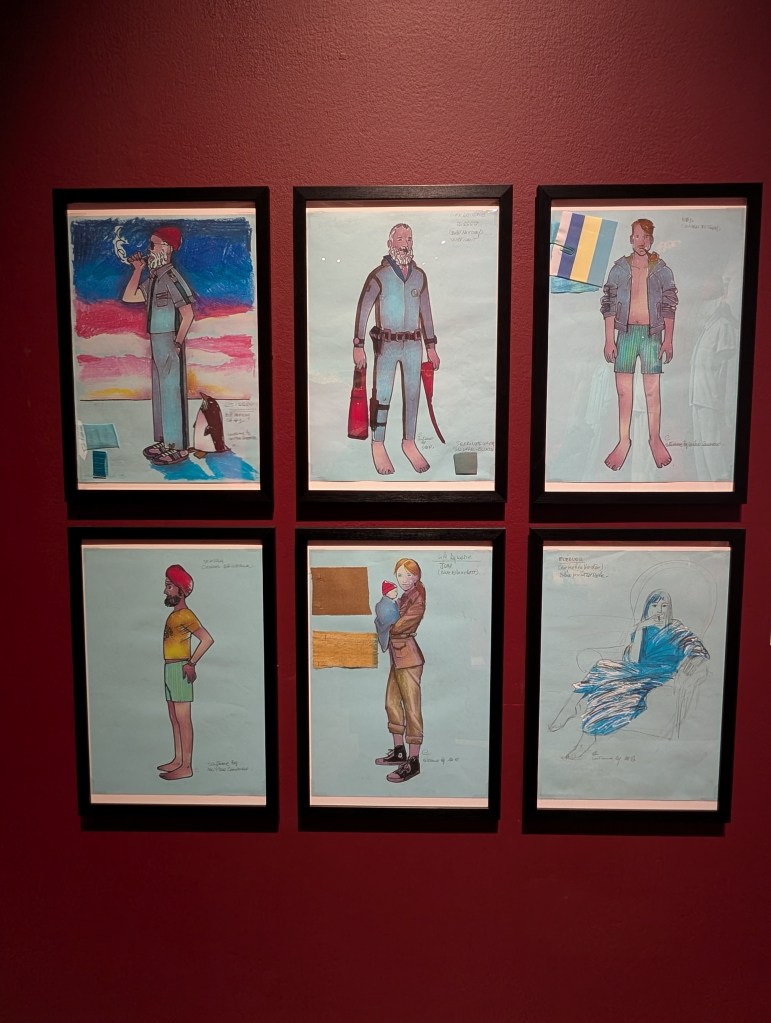
Life Aquatic
While this section included many iconic items including models used for the sea life (which were surprisingly a lot larger than I had assumed they would have been), props such as the scientific books written by Eleanor, Hennessey’s cover of Oceanographic Explorer, the fabulous wet suit painting of Steve Zissou & More, my personal highlights from this section are the iconic outfits (red hats included of course) & accompanying illustrations for them. They are such an aesthetic trademark of this movie that I truly could not have picked anything else as my highlight.
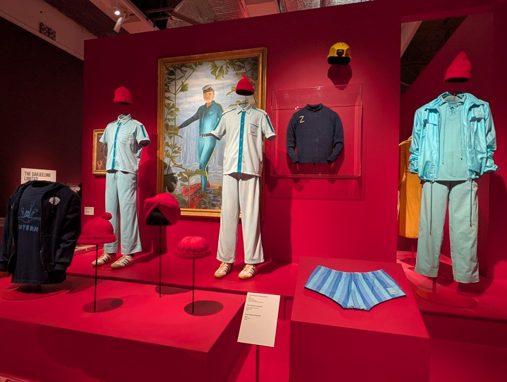
Again I was taken aback by the level of detail in each one of them, as well as the quality which is impeccable, and truly something that you would only notice when in close proximity. I, of course, had to include the design illustrations just to showcase how much of an amazing job was done in bringing them from sketch to real life. I left this section secretly hoping they had recreations of the hoodie, t-shirt and team pennant in the gift shop, but sadly they did not.
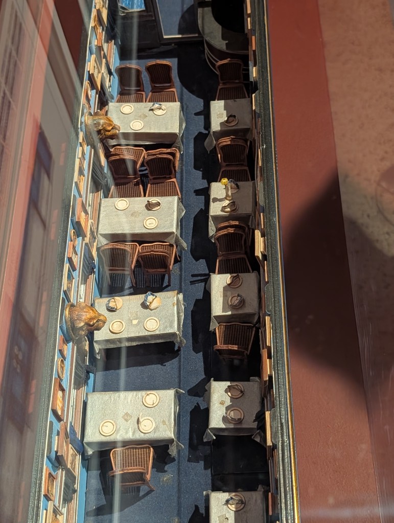
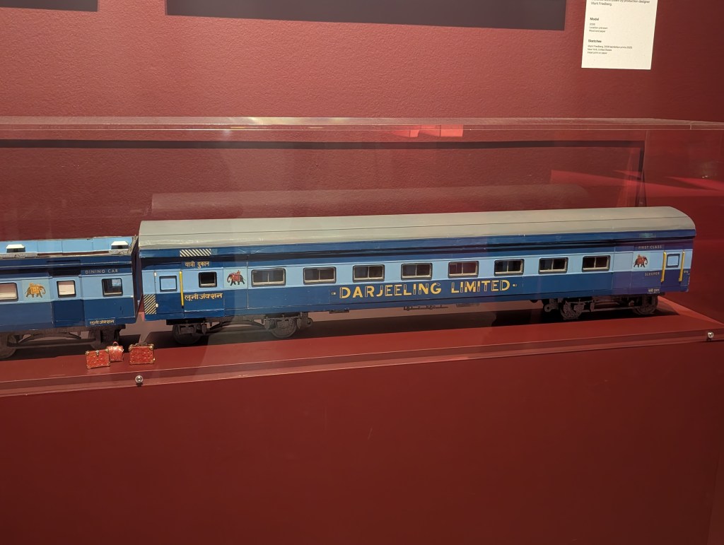
The Darjeeling Limited
While I went into this section expecting that I would come away from it and see the classic monogrammed patterned suitcase collection as my highlight, given how much of a critical part it plays within this film’s story, I was in fact wrong. While it was definitely amazing to see those suitcases in real life, my highlight from this section was in fact the meticulously crafted miniature scale model of the train, which was so intensely rich with detail.
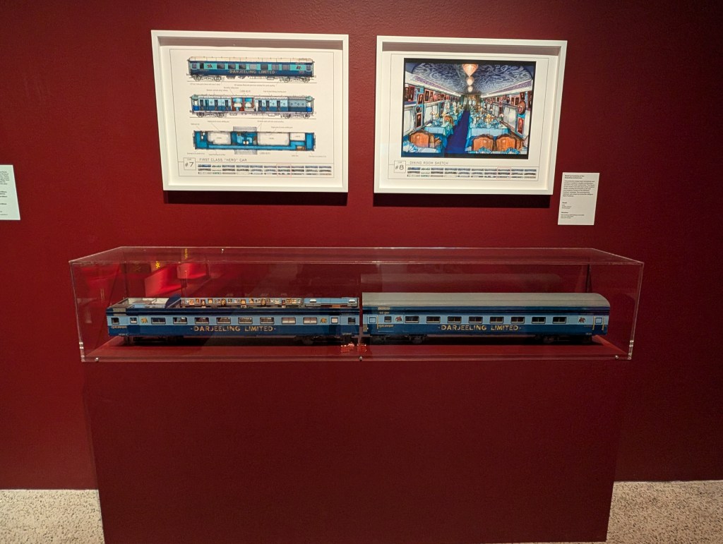
All of the details from the full size version were included, all the way down to tiny plates napkins, which were used to visualize, plan, and block out the intricate scenes and camera movements for The Darjeeling Limited, which was also accompanied by intensely detailed sketches.
At this point I thinking I had already come to terms with the fact that my main takeaway from this entire exhibition was just how important the details are, and I had come to release upon leaving this section that the sheer amount of time I have spent pouring over the smallest details in everything I have ever worked on was never wasted, because there will always be someone like me out there, that is drawn to it and notices everything.
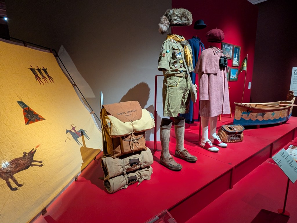
Moonrise Kingdom
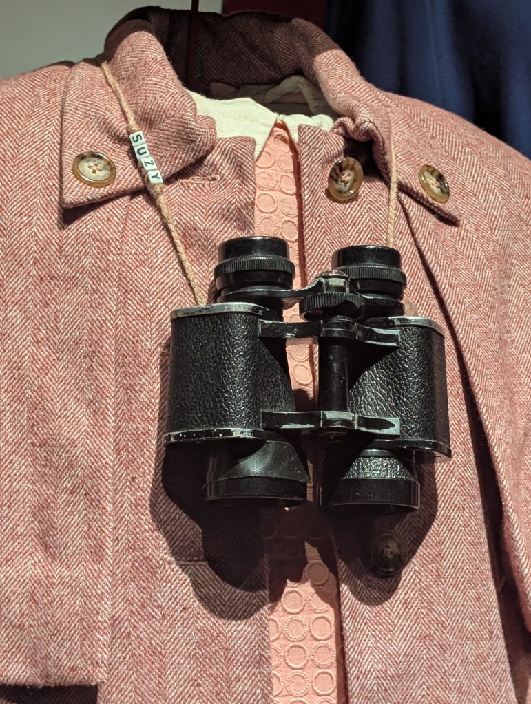
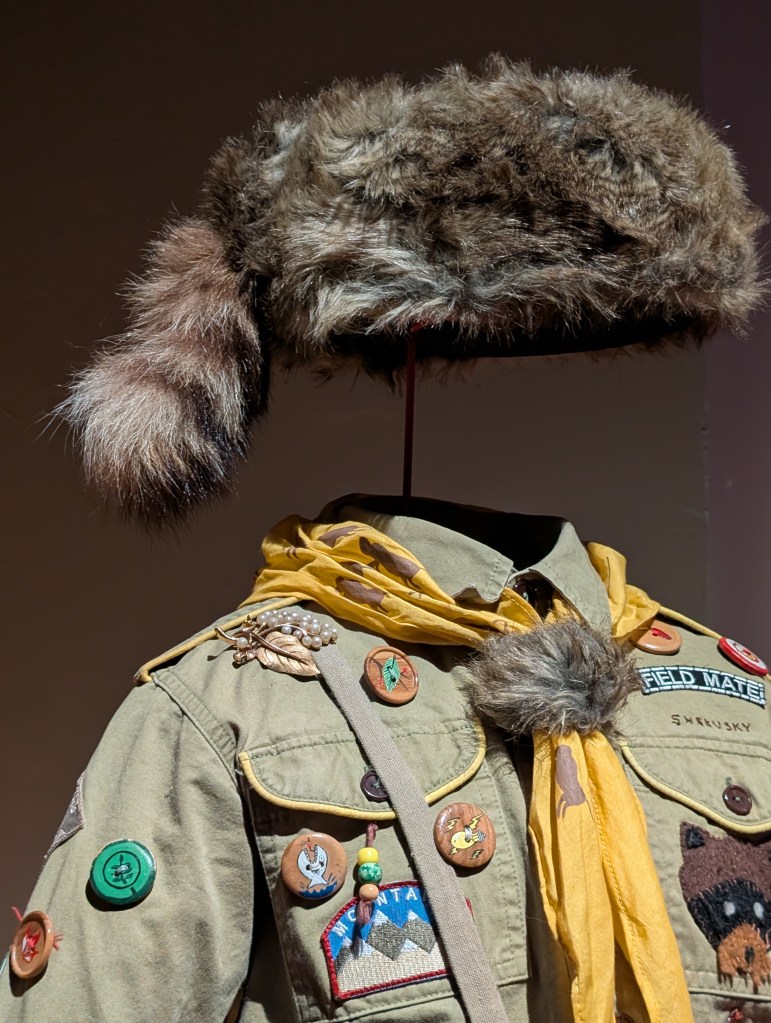
Moonrise Kingdom is my favourite Wes Anderson film & I spent the most time in this section overall, looking over every single little detail of every item and just taking it all in. I would undoubtedly say that this part of the exhibition is the part that made me feel the most emotional, it’s one of my comfort films and I see part of myself in its characters and honestly, I knew that narrowing down highlights from this section was going to be hard because of that. I think if I were to have to narrow it down to just one / thing it would be Sam & Suzy’s outfits, because I never realized just how much detail there was in both of them until this exhibition (see I told you my brain was hyper focused on details the entire time).
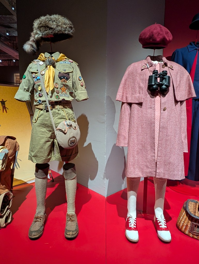
My favourite detail in Suzy’s outfit is something I had never noticed before despite having watched Moonrise time & time again, and it was just four little beads that spell out her name on one side of yarn that she uses as the strap for her binoculars.
On Sam’s outfit my favorite details are by far the countless patches, painting buttons and scout badges, as well as the way his name is sewn above the breast pocket in such a childlike way (to give the impression that he did it himself) and the felt racoon patch on his breast pocket. While these were details I knew existed, you can rarely look over each one closely on screen, so being able to do that in real life was such a priceless experience.
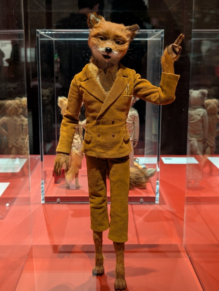
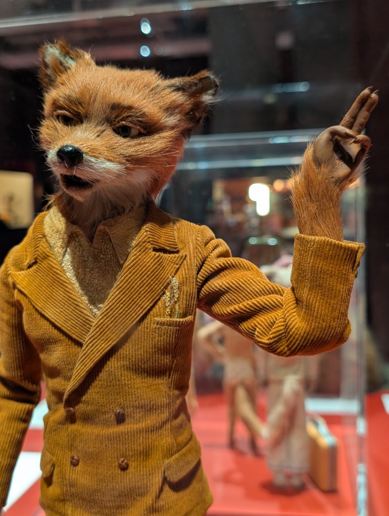
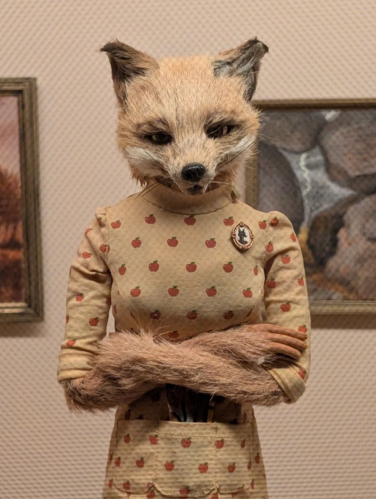
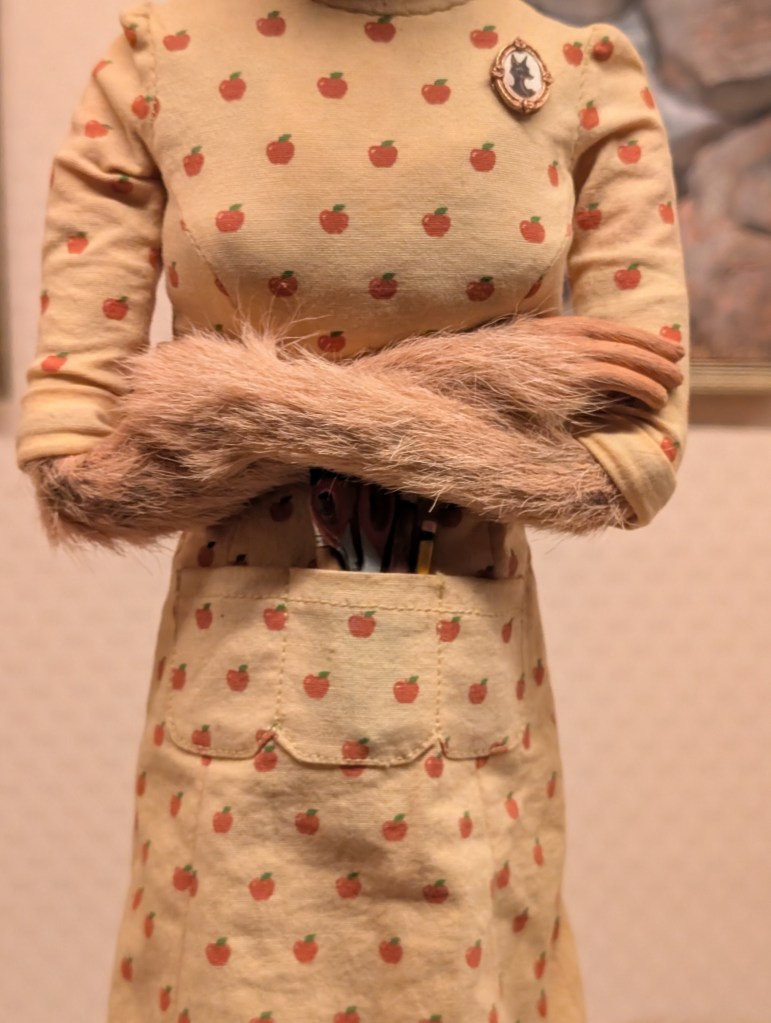
The Fantastic Mr Fox
Undoubtedly my highlights from this section were the many insanely detailed stop motion models, but if I had to narrow it down even more than that I would have to pick two specific models. Firstly, the models of The Fantastic Mr Fox in his trademark yellow corduroy suit; getting close to this model and seeing how detailed the fur is on his face, hands, legs and feet are, how much emotion can we find within his face and the detail of his yellow corduroy suit completely blew me away, and I can’t even begin to imagine how long it took to craft something so small in so much detail.
Secondly, it would be the slightly smaller model of Felicity Fox, again for the sheer amount of detail not only in her fur, but also in her outfit and all of her accessories, and her accompanying easel and tiny, tiny pieces of art. The very small details of her model such as her broach and the scissors, pencils and paintbrushes in her dress pocket however are what truly left me awestruck and speechless.
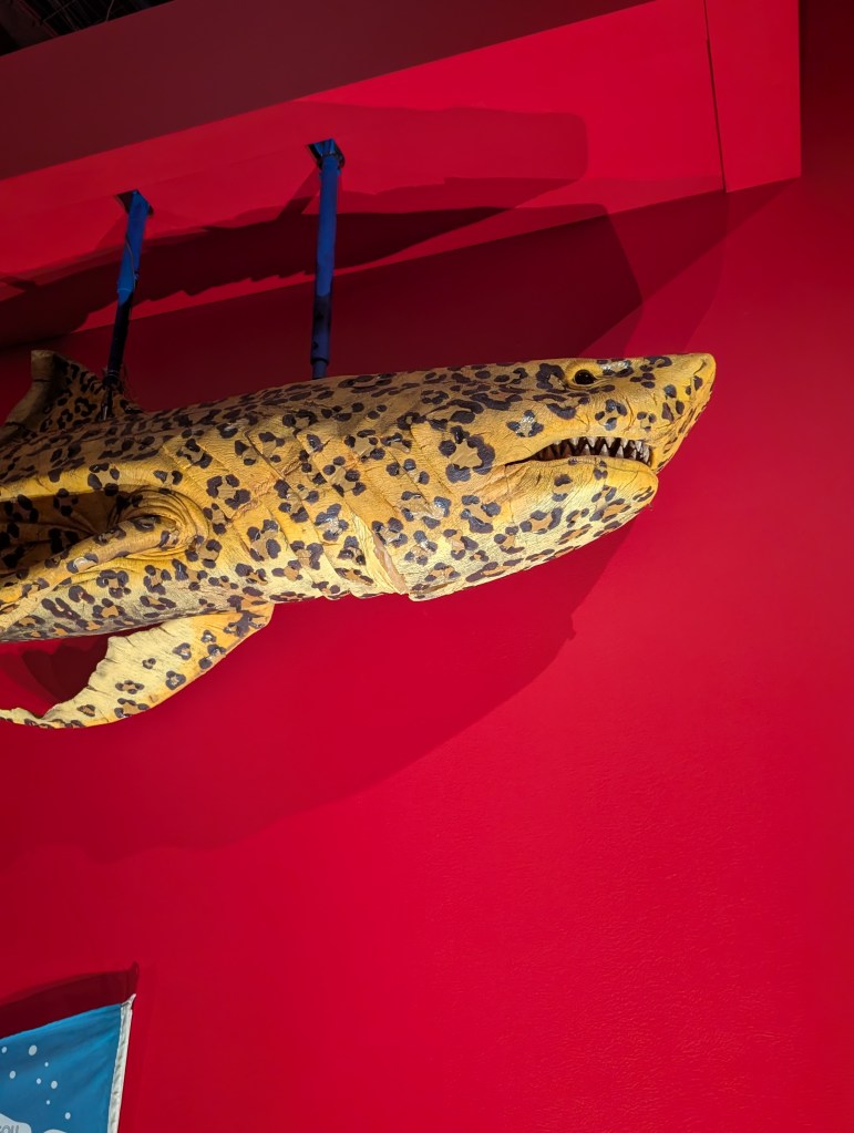
Isle of Dogs
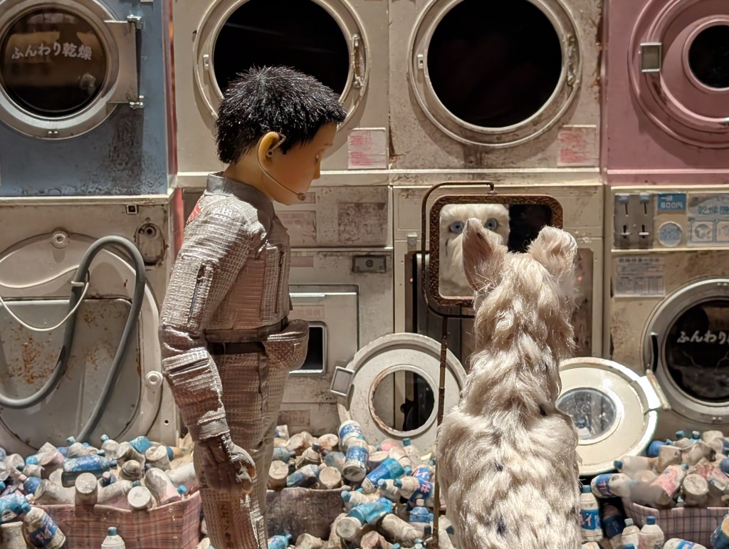
Of course my highlight from this section was again going to be one or more of the incredible stop motion models that were on display, and while I could honestly have picked every single one because it feels horrible to have to pick just one or two from such a gorgeous base of work that made the movie so special, I would have to say that my favorite of them all was the models of Atari Kobayashi and Spots, specifically the ones displayed in a case with the backdrop of a meticulously crafted laundry set, featuring countless washing machines & dryers, each with their tiny buttons, labels, wire and more.
Beyond that, there was an insane amount of minute water bottles, metal bottles and cans covering the floor, and the cherry on top of the cake is of course Atari Kobayashi and Spots, each with so much emotion captured within their faces, so much so that you feel like they would begin to move if you stayed with them long enough. They are truly breathtaking works of art.
The Grand Budapest Hotel
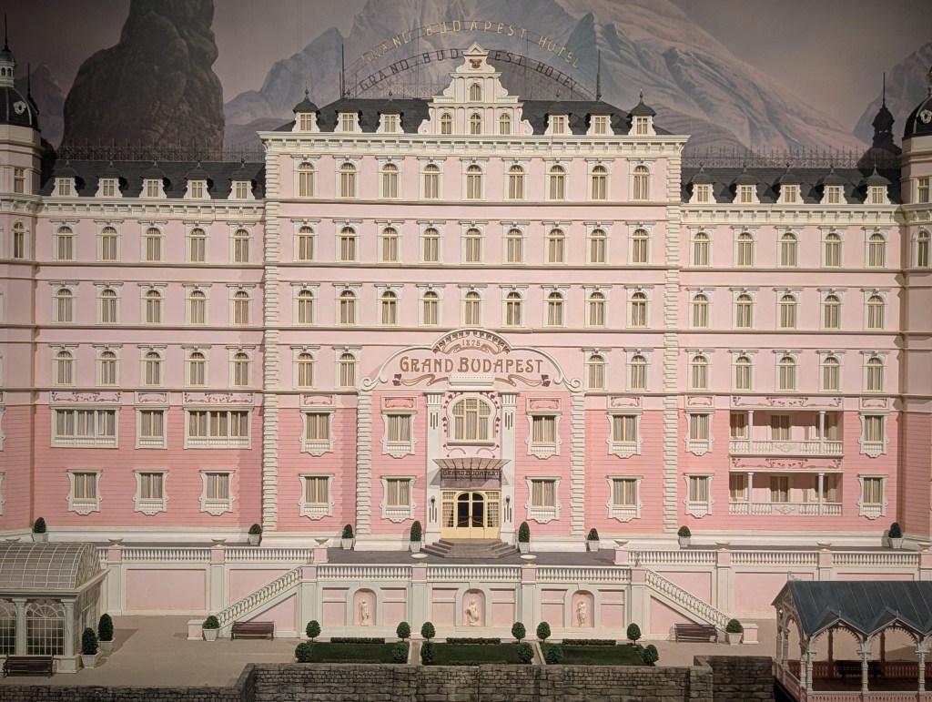
This was yet another section of the exhibition that opened with an almighty bang, this time in the form of a 1:18 scale physical miniature of The Grand Budapest Hotel, Built by designer Simon Weisse in Berlin, the candy-pink model spans over 3 meters in width and is famed for its intricacies, and was used for the external shots of the hotel to avoid using CGI at all costs.
The movie is my third favourite Anderson movie, but does however still come very close to both Rushmore & Moonrise with not much space between the three of them at all. So I knew that (again) it was going to be hard to pick just one highlight from this section especially because it was one of the most jam packed sections in the exhibition and it started in such a brilliant way.
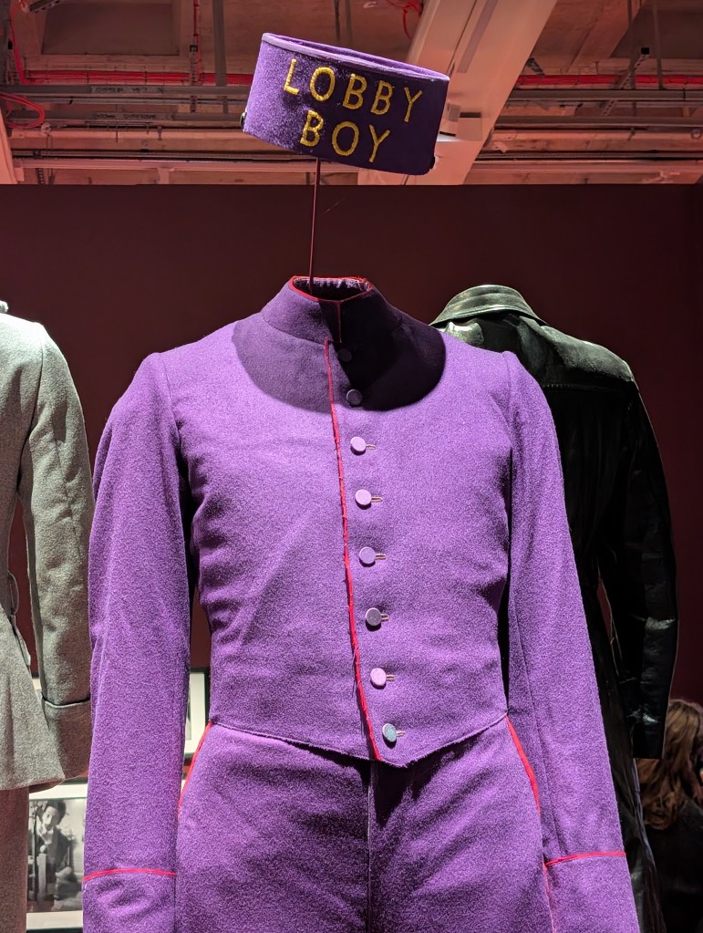
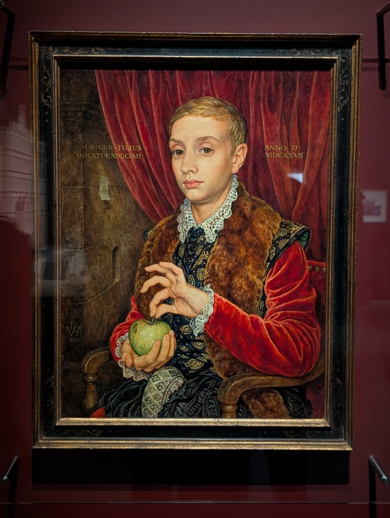
However, if I were to pick a minimum two highlights from this section (beyond the hotel of course) they would be Zero’s lobby boy outfit & the Boy With Apple painting by Michael Taylor. Two pieces that are so incredibly pivotal to this film’s visual identity & its storytelling.
As an art & art history nerd, I knew that he Boy With Apple painting was bound to be a highlight for me, it’s so well executed and the stand out to me within it is how well the many different fabrics were painted, from velvet to lace details and everything in-between, no wonder this painting is so highly sought within the Grand Budapest Hotel’s story.
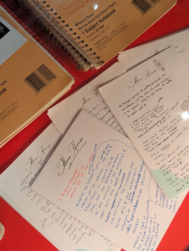
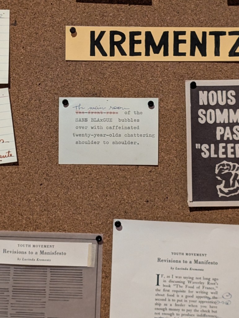
The French Dispatch
Without a doubt my highlight from this section of the exhibition was the faint issue in progress notice board and the accompanying issues of the French Dispatch below it. I don’t know exactly how much time I spend in front of the notice board combing over every single piece of paper pinned to it.
Each and every one had a purpose and none of them were filler, they all added something and I swear I saw three or four full groups of people come through this section of the exhibition in my peripheral vision while I was on front of this noticeboard, but it was more than worth all the time spent in front of it taking everything in.
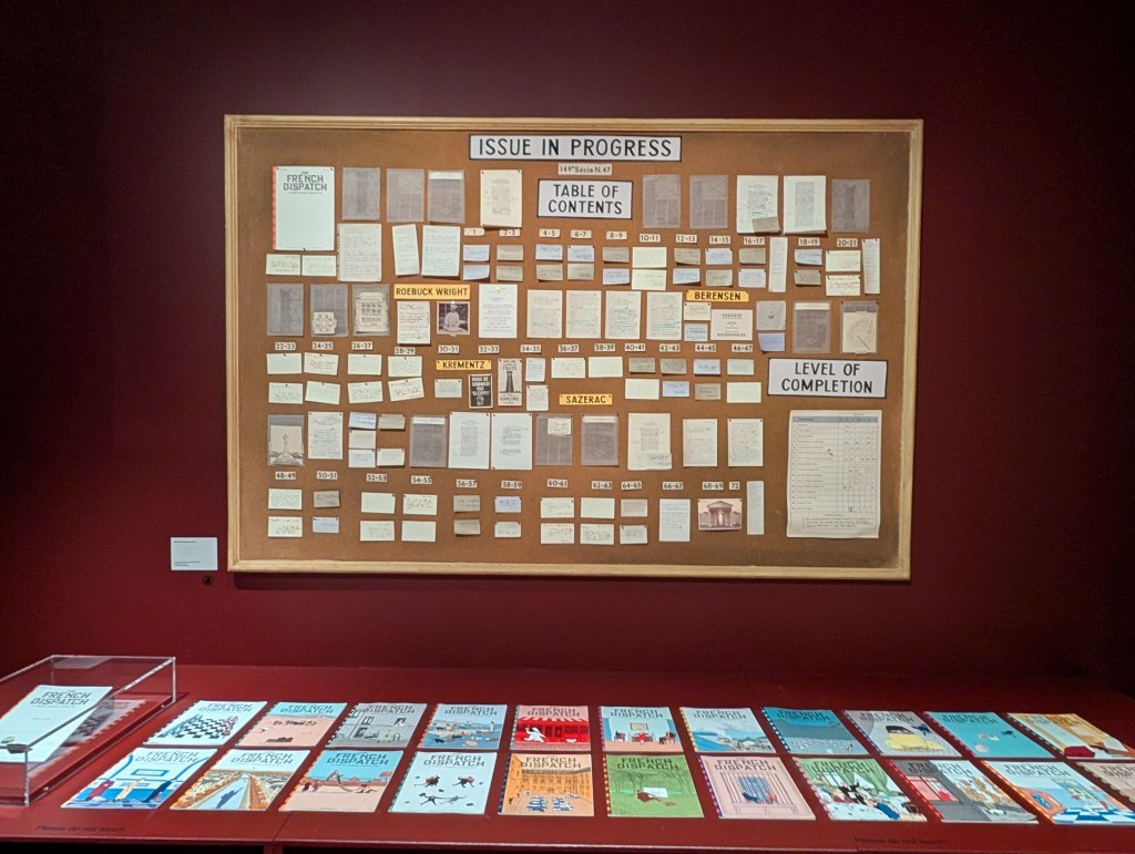
One of my favourite pieces on the board reads “The main room THE FRONT ROOM of the SANS BLAXGUE bubbles over with caffeinated twenty-year-olds chattering shoulder to shoulder”, however the entire board is filled with gems linked to every character and story told throughout the film and I’m so glad I took detailed pictures of each of the sections so I can’t go back and read them all, time and time again.
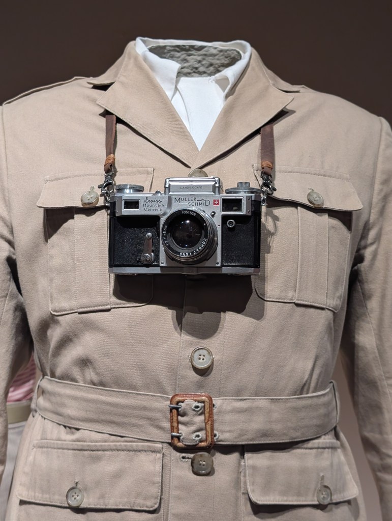
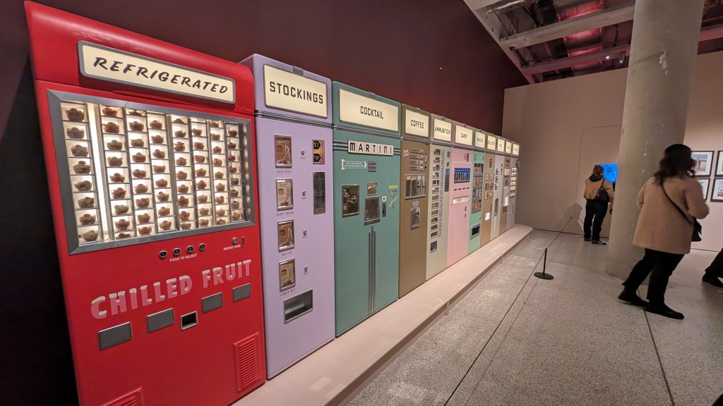
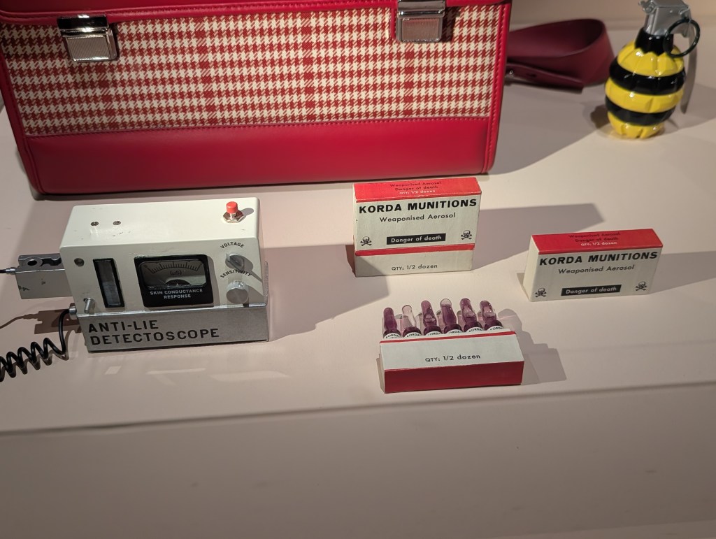
Asteroid City
Out of everything in this section I decided on three specific items as my highlights, firstly Augie Steenbeck’s camera, secondly the The Alien and finally the insane selection of very unique vending machines.
As a photographer with a degree in photography I was always going to be drawn towards a character with a camera like Augie and it’s was so cool to be able to look over the camera and all of it’s little touches that help to flesh out his character, such as the combat lens & just how worn the camera truly looked.
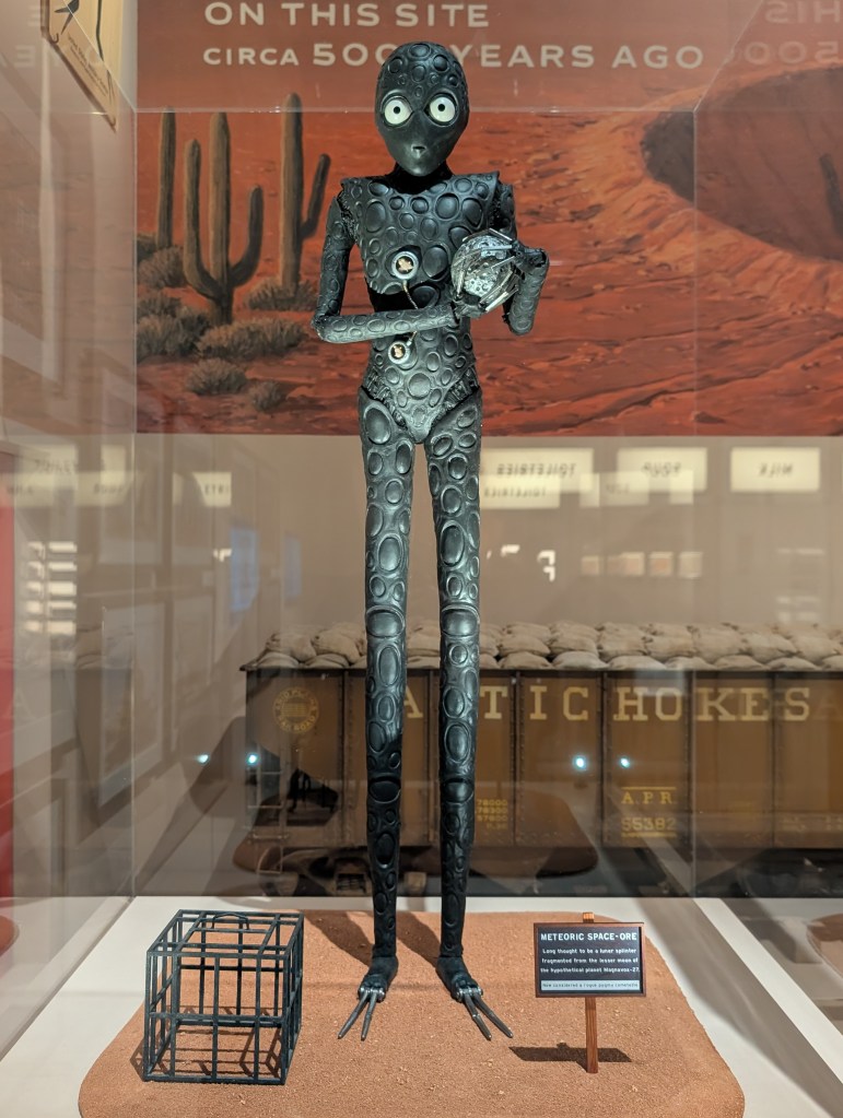
And how could I not include the Alien in my highlights, just look at him. There’s so much character captured within his model and so much character in eyes and the way he is posed.
Then lastly, the many stunning pastel coloured mid century style vending machines, all of which (aside from the ammunition one of course) should without a shadow of a doubt be commonplace in real life. I think my favourite one of all of them is the cocktail one, despite the fact that I don’t drink, and I would love to see it actually operate, because I just seemed like it would be so satisfying to watch it create a martini step by step.
Just like every other section from this exhibition though, narrowing down to only a few highlights was hard and there are many more pieces that could have made this list.
The Phoenician Scheme
This was another small section towards the end of the exhibition but i think it bookended everything nicely, this film was fresh in my mind going into this exhibition, and being able to see a selection of the props that were so pivotal within its storytelling and being able to recall the scenes they featured in perfectly was a fantastic way finish off the exhibition.
My highlight when it came to this small selection of items was more the sheer amount of detail within them rather than one specific item, it just further cemented the fact that the level of care and attention to detail in these movies is second to none. While you can definitely read that from what is presented on screen, there’s an extra level of wonderment created when you can pour over that detail in real life.
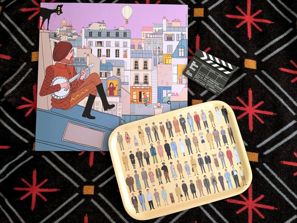
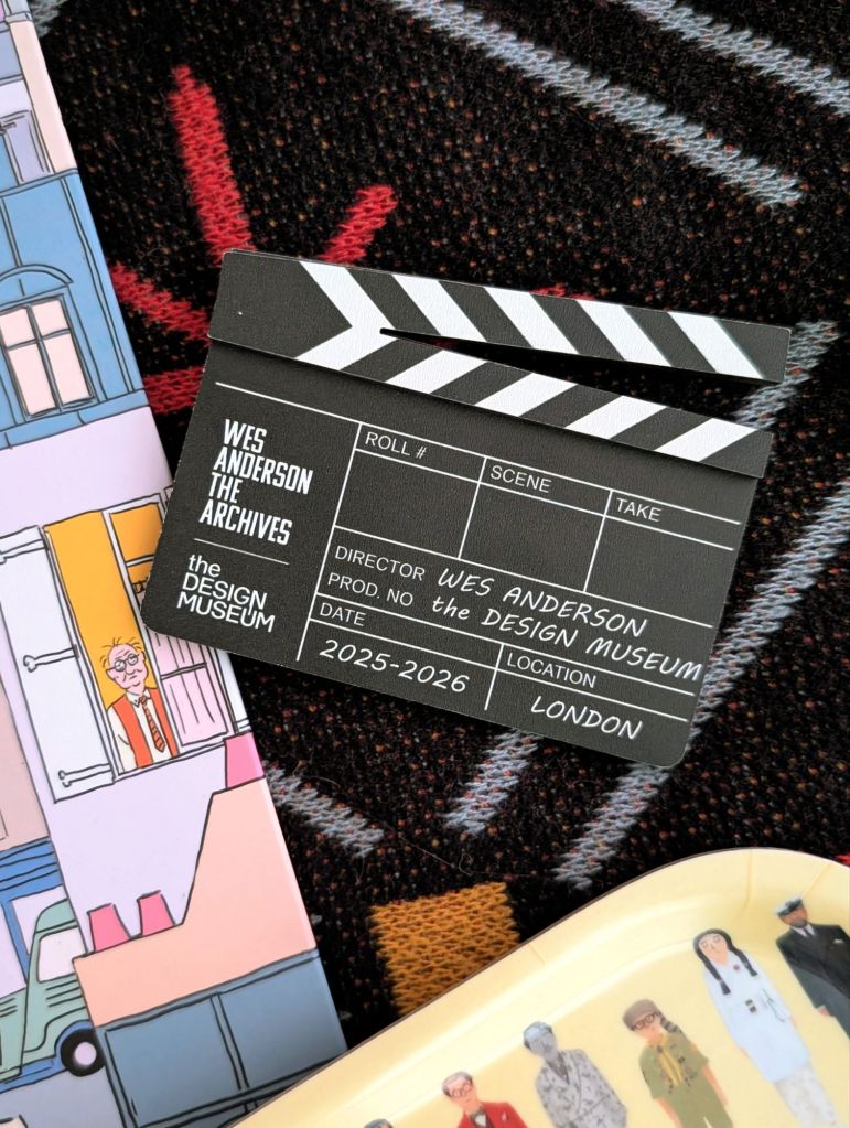
Of course no visit the an exhibition is complete without a visit to the gift shop and this was definitely I gift shop I was very eager to explore, and honestly if money were no object I would have bought one of everything, but I did go in with a spending budget and was happily able to grab three items without superseding it. I ending getting a fridge magnet to add to the ever growing collection on my fridge, The Fantastic Mr Fox X The French Dispatch Vinyl which was limited to 1000 copies worldwide, & finally a wooden tray to use for tea session that features many Wes Anderson characters designed by Max Dalton.
This exhibition was just as incredible as I assumed it was going to be and not only met my expectations, but completely exceeded them. While we don’t live close to London, I’m glad that we made the trip down and got the chance to visit this exhibition as part of that trip, it was more than worth setting the time aside for and I definitely would have been heartbroken to have missed it.
Luckily you still have the chance to visit as this exhibition was supposed to run until 26 July 2026 but has just been extended until 16th August 2026, so pay The Design Museum a visit before it closes, you will not regret the decision.
Visit The Design Museums website to find out more about the exhibition and book your tickets.
Until next time, Happy Steeping – Kimberley

You must be logged in to post a comment.