Around mid July, I had the chance to visit York Art Gallery and their Latest exhibition titled, Making Waves: The Art of Japanese Woodblock Print, an exhibition that explores the history and development of Japanese woodblock printing, revealing its origins and techniques alongside the influence of nature, society and cultural change on this art form. The exhibition covers over 300 years of printing history, from the 17th to 21st century and features over 100 striking & iconic works by world-renowned artists including Katsushika Hokusai, Utagawa Hiroshige and Kitagawa Utamaro amongst many others.
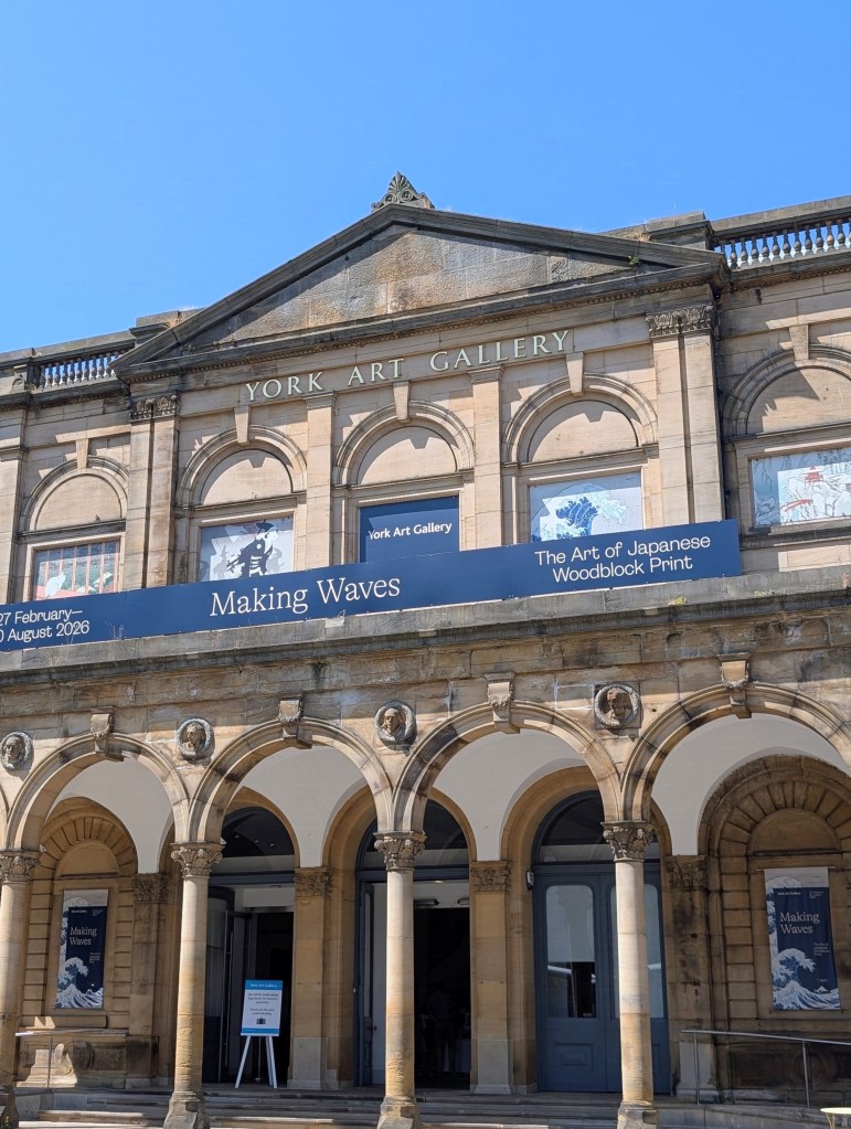
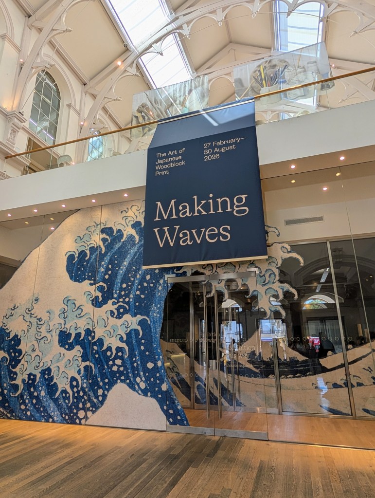
Many of the Japanese woodblock prints on display within this exhibition are from York Art Gallery’s extensive collection, with some of them being displayed for the very first time. They sit alongside many incredible loans from various regional and national institutions, including early printed books from the British Library, kimonos from Durham Oriental Museum, armour and swords from the Royal Armouries, and a selection of prints from the British Museum, Ashmolean Museum and Maidstone Museum, including Katsushika Hokusai’s iconic “The Great Wave off Kanagawa”, one of the most recognisable and celebrated artworks in the world.
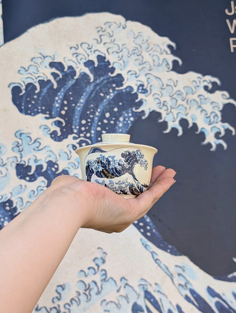
In my last few exhibition round-ups, I have included a tea pairing for each exhibition and I couldn’t wait to pick the perfect companion for this exhibition. As someone who drinks a lot of different Japanese teas pretty regularly, deciding which one paired the best with this exhibition was quite the task, however given that the day we visited was such a warm summer day, I ultimately decided on a Japanese white tea that has a delicious peachiness within it, and was also large enough leaf wise to be brewed in a gaiwan, as I simply couldn’t miss the opportunity to take my travel tea set inspired by The Great Wave off Kanagawa from teatsy to this exhibition.
Having the opportunity to view these woodblock prints in real life and getting the chance to get so close to them showcased something to me that I could have never seen through a screen – texture. Many of the woodblock prints within this exhibition are just as rich in texture as they are details, and in learning about how much work went into creating these woodblock prints and how many steps were involved, you begin to understand that not a single part of them was accidental, and each choice is purposeful and intentional.
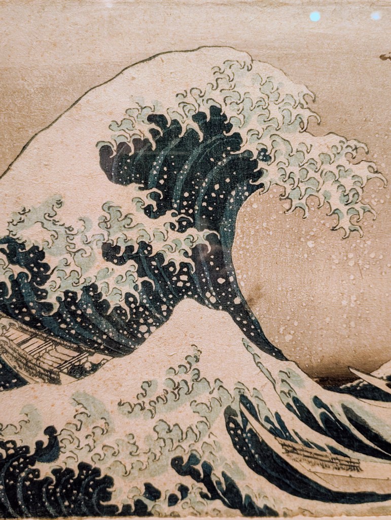
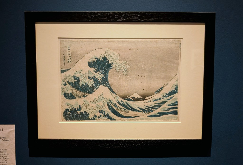
Being able to see the embossed texture within the fabric of kimonos highlights the masterful craftsmanship of the designers, and the way in which the fine ocean spray leaves the tips of The Great Wave off Kanagawa has such dimension to it, adding depth and aiding in telling the story of how powerful the wave truly is and how hard the men on the boat would have had to work to avoid getting overcome by that immense power.
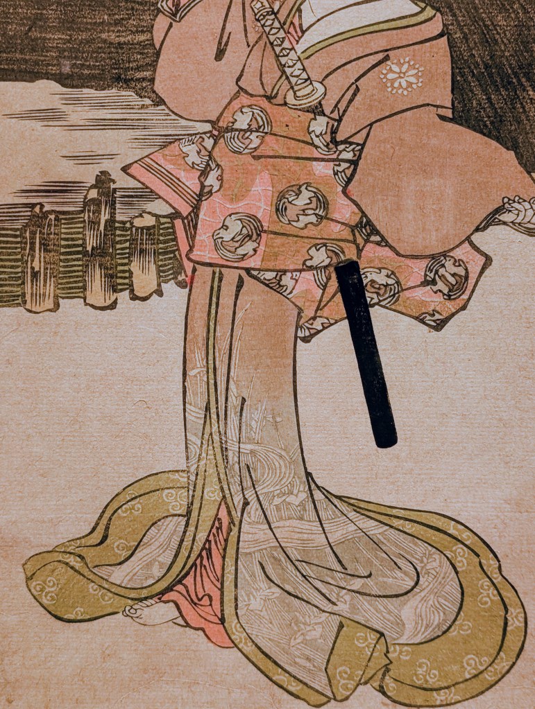
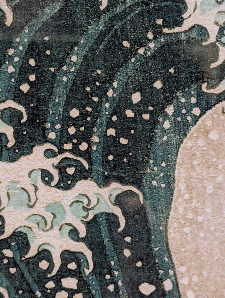
Though the prints themselves are truly the stars of this exhibition, I am amazed by the texture of the washi (a soft, durable handmade paper created from bark / plant fibers like kōzo (paper mulberry), gampi or mitsumata) that they are printed upon. The texture of the plant / bark fibers only becomes noticeable up close, & what truly shocked me was how much texture the paper still had despite it being so thin, highlight why this kind of paper is used, because it can be both thin and lightweight but also incredibly flexible and absorbent, the latter of which was needed to ensure that the water based inks were able to be completely absorbed, allowing such incredible levels of colour to have such a lasting power.
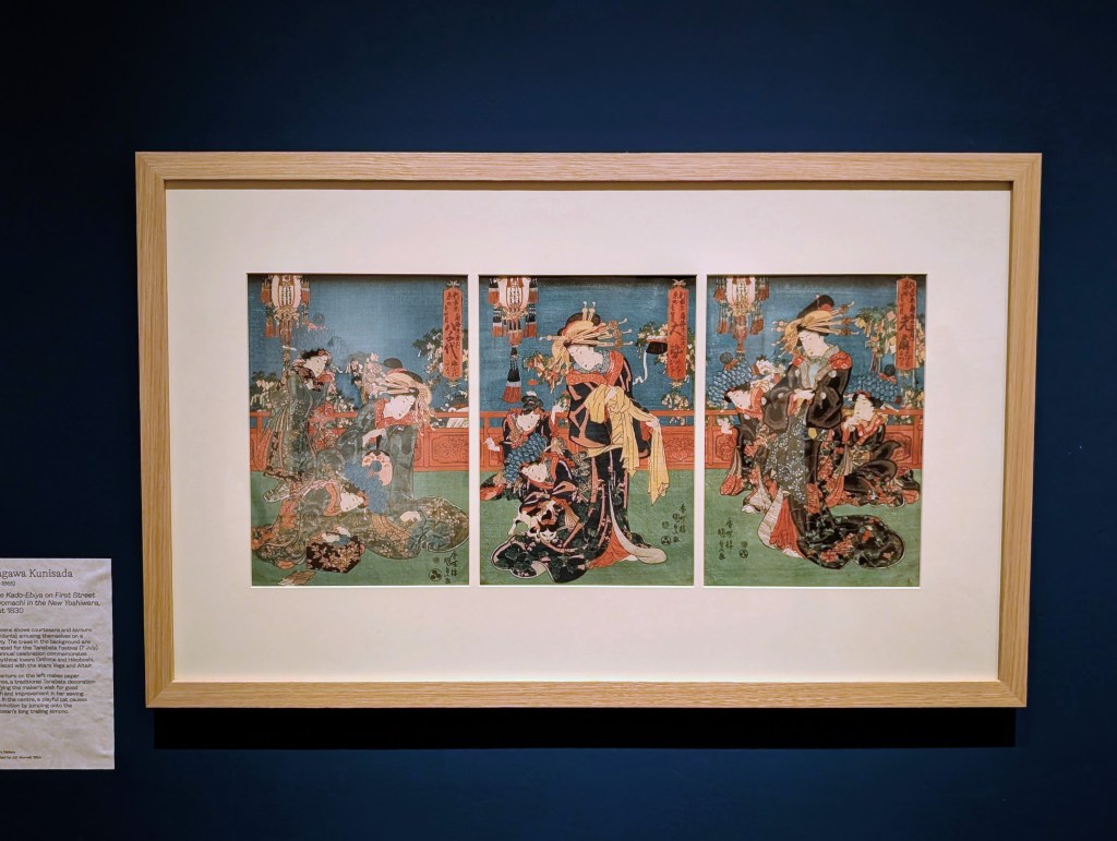
Beyond texture, I of course have to talk about the level of detail found within each and every single one of these prints, but in narrowing (because I cannot discuss everything) it down, I was immediately drawn to the myriad of details found within two pieces in particular. Firstly, Utagawa Kunisada’s “In the Kado-Ebiya on First Street in Kyomachi in the New Yoshiwara” (about 1830), a scene that shows courtesans and Kamuro (attendants to the courtesans) amusing themselves of a balcony, the Kamuro on the left makes paper kimonos & in the center, a playful cat causes commotion by jumping onto the courtesans long trailing kimono. The sheer amount of detail within each and every separate frame of this piece left me feeling awestruck, but it’s especially notable within the impeccably patterned Kimono fabric, and the tassels on the hanging decorations, made up of the finest of fine lines I have ever seen.
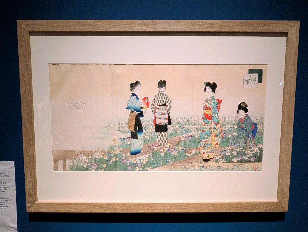
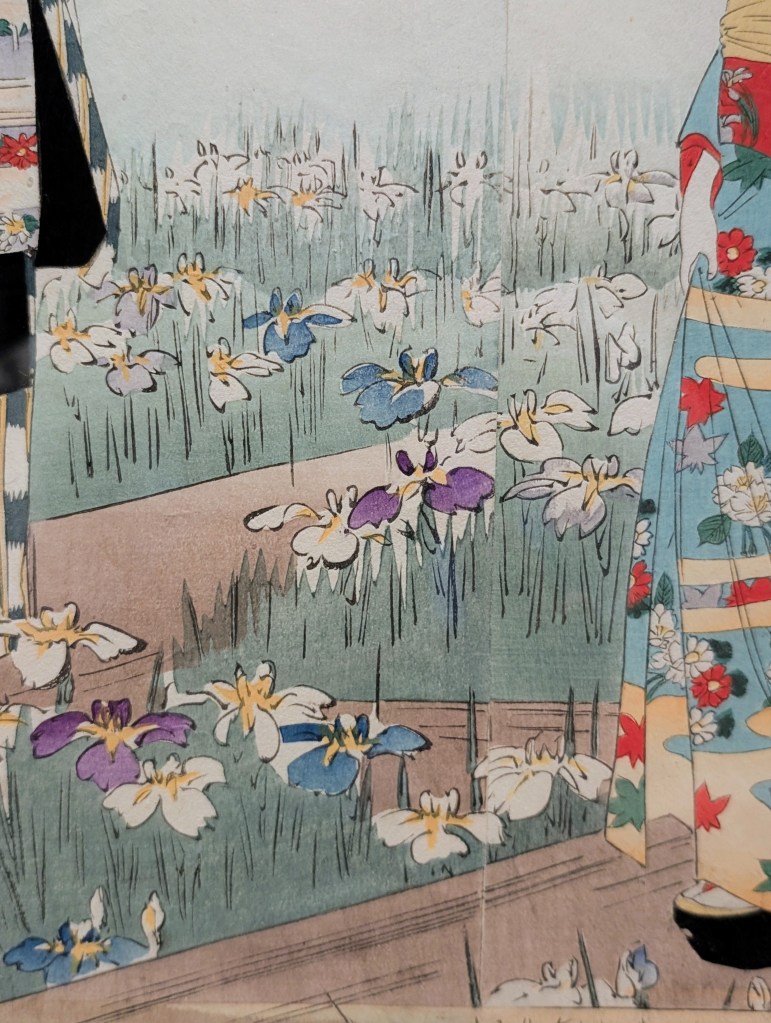
The second piece that stood out for me was Miyagawa Shuntei’s “June”, from the series “Twelve Moths of The Year” (about 1898), a print that comes from a series showing women enjoying themselves in gardens throughout each month of the year. Each of the women within this one wears rich & uniquely patterned kimonos, and are placed within a water garden, surrounded by beautifully depicted colourful irises as far as the eye can see. There is a light summer airiness within the atmosphere of this print, with the details doing a fantastic job at immersing you within that environment.
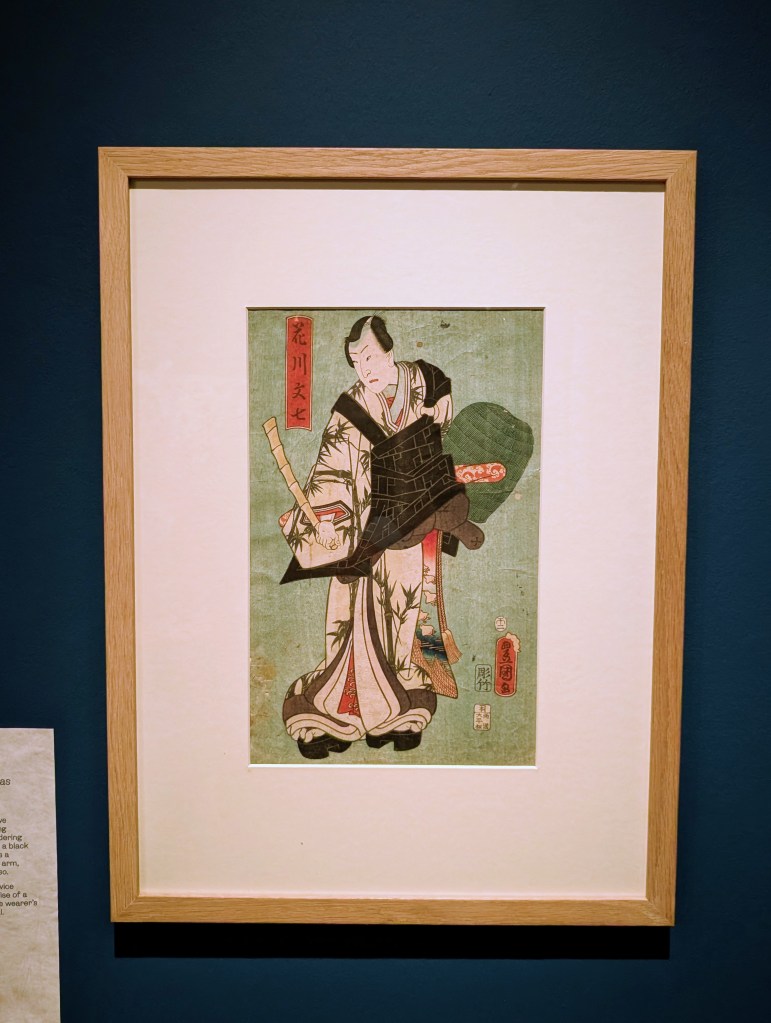
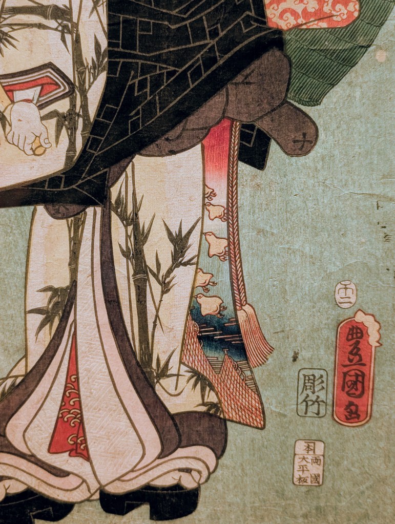
Another aspect found within many of the woodblock prints throughout this exhibition that stood out to me was the incredible colour gradients. Of course, being a fan of this kind of art for a long time, I was aware of how beautifully the artists behind these prints created breathtaking colour gradients, but seeing them in person just completely and utterly floored me. The colors blend into each other so beautifully, with nary a harsh line in sight. One of my favourite uses of these gradients was found within a section of the kimono worn by the actor captured within Utagawa Kunisada’s “Actor Sawamura Tossho II as Hanakawa Bunshichi” (1858) that not only features beautiful, fine line detail, but also a colour gradient that seamlessly flows from red to light blue, becoming a richer dark blue for a short time and then move back into light blue. My picture makes it look much bigger than it is, but in reality it is such a small section of this print that contains so much beauty.
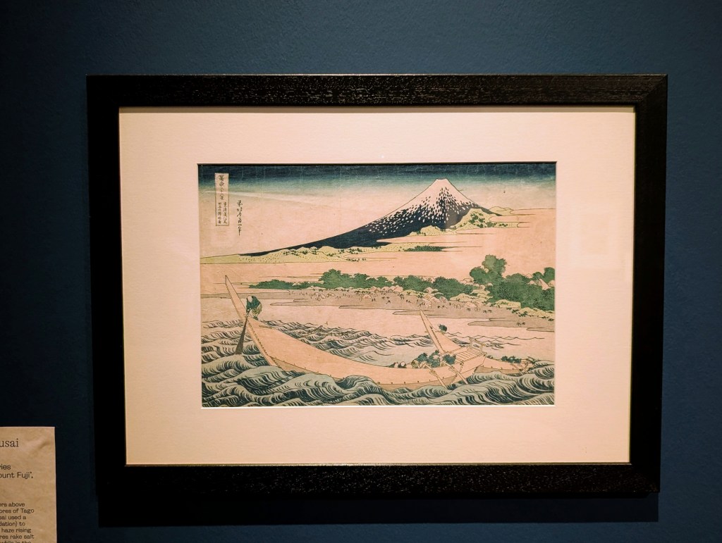
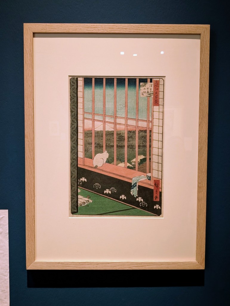
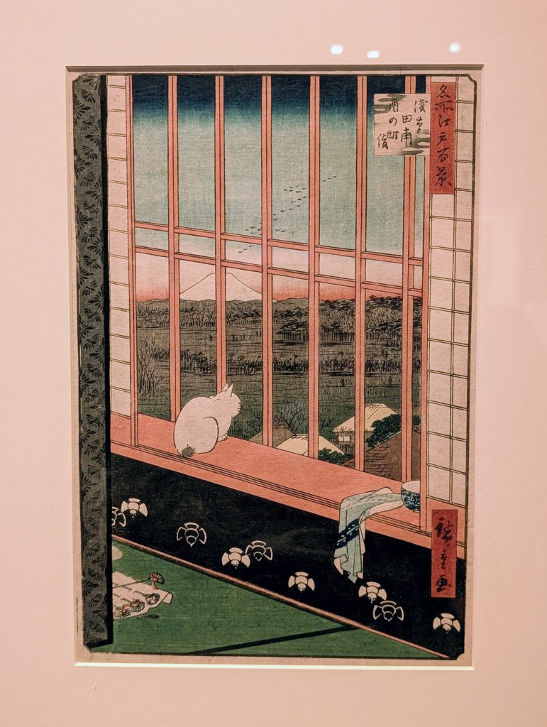
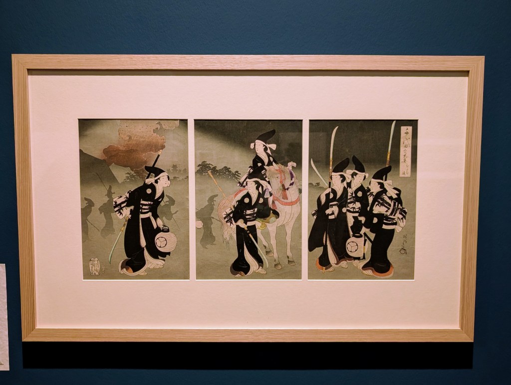
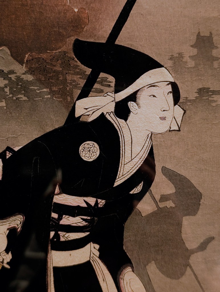
Beyond that, when talking about gradients in Japanese woodblock prints, I of course have to discuss the ways in which skies are depicted. Whether they are at sunset, sunrise or any other time of the day, you will always find seamlessly executed gradients, be that in colour or black and white. My favourite examples of this that can be found within this exhibition are as follows:
In colour: Katsushika Hokusai’s “Tago Bay near Ejiri on the Tōkaidō (Tōkaidō Ejiri Tago no ura ryaku zu)”, from the series “Thirty-six Views of Mount Fuji (Fugaku sanjūrokkei)” (1830–32) & Utagawa Hiroshige’s “Asakusa Rice fields & Torinomachi Festival”, from the series “One Hundred Famous Views of Edo” (1857), both of which only use the colour blue and shift from dark to light as your eye moves from the top of the print downwards.
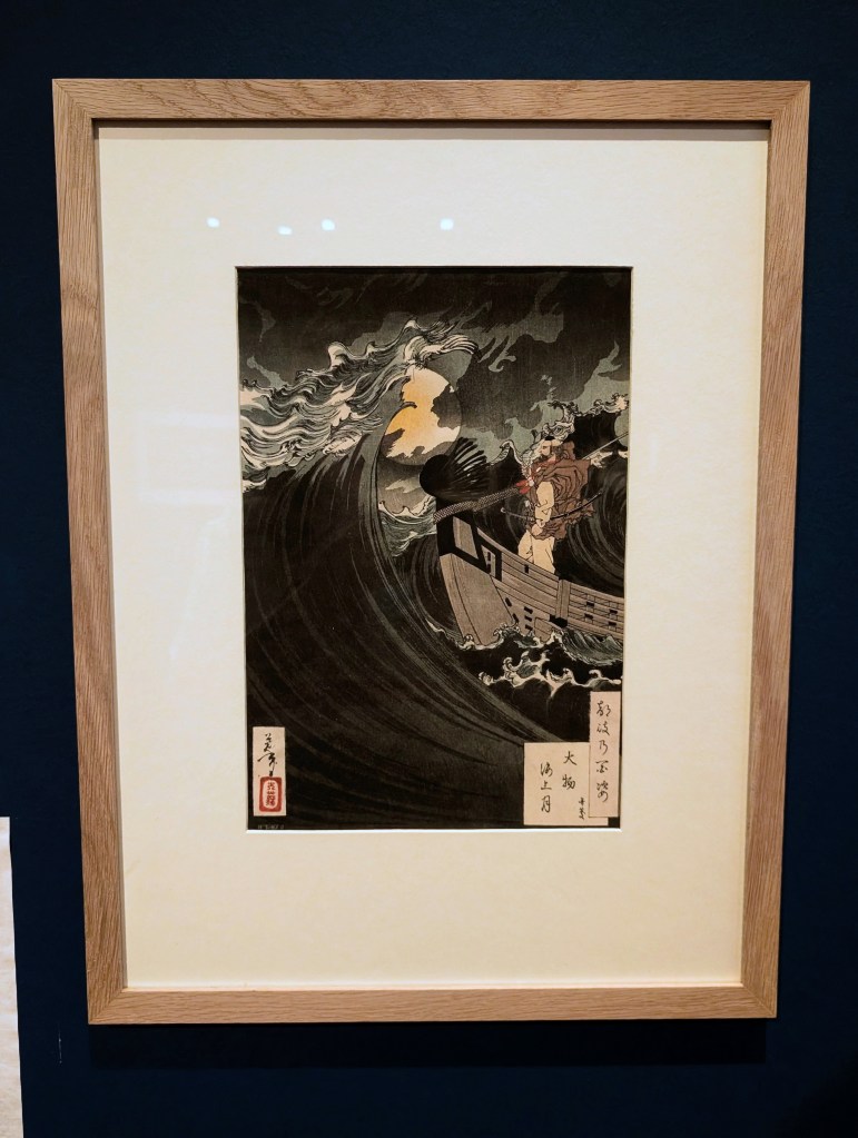
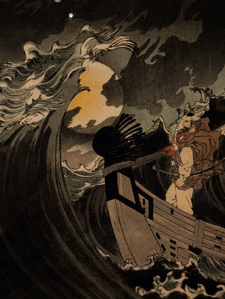
In black & white: Hashimoto Chikanobu’s “Evacuation of Chiyoda Palace” from the series “The Inner Palace of Chiyoda” (1896) & Tsukioka Yoshitoshi’s “Benkei in a Boat Calming the Waves in Daimotsu Bay”, from the series “One Hundred Aspects of the Moon” (1886), the latter of which has a lesser gradient than the first, but it is still noticeable and captures the depth and prowess of the stormy sky perfectly. The gradient within the former on the other hand is much more noticeable and serves as a tool to tell the story of how much smoke came from the Great Fire of 1844, filling the night sky and holding the silhouettes of the figures fleeing the castle within it.
I could not finish this post without, of course, talking about “The Great Wave off Kanagawa” by Katsushika Hokusai. I had hoped to see it in person at the British Museum a few years ago, but it wasn’t on display at the time, so I was thrilled to finally have the opportunity to see this masterpiece in person & spent an insane amount of time in front of it, combing over every section of the print and absorbing everything it had to tell me within its detail, texture and colour. The beautiful palette of blues that dominate this print are still so bright and rich, as if it had only just been finished and not created almost 200 years ago, with the lines being so crisp and defined, with so much depth and power held within. It was truly fantastic to have the opportunity to view it in person and I hope I get the opportunity to view it again in the future.
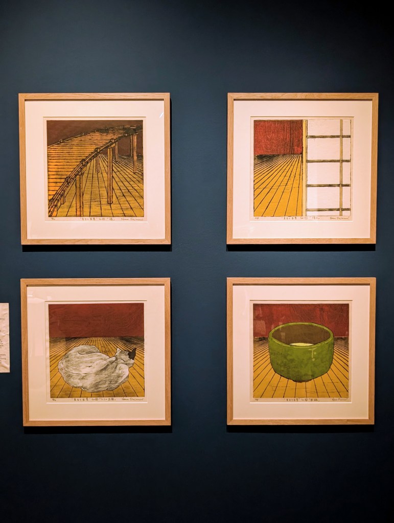
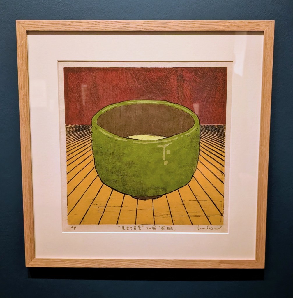
I also have to include an honorable mention highlight before I close off this post that’s centered around tea. Nana Shiomi’s “Tea Bowl” (2001) is one of four on display from the series “One Hundred Views of MITATE”, a series in which there are references to the ukiyo-e practise of producing thematic prints, as well as the traditional genre of mitate-e (analogue pictures), in which one subject is used to allude to another.
Each of the prints focuses on an object from Japanese culture or print history, dramatically placed in the foreground of a mysterious, receding space. Shiomi explains “by combining two or three of these elements together, I hope that other meanings will come out of these permutations”. For me, this set of prints, when viewed together, told the story of a journey to a tea house and the details found within that environment as you move further towards it, finally focusing on just the tea within the bowl once you have reached it.
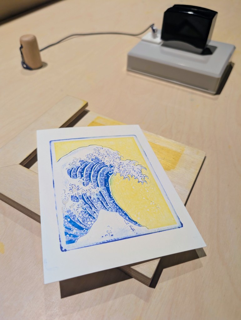
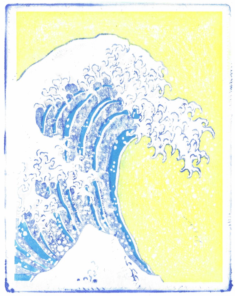
In the same room as this series of prints, a station composed of four sections had been created to allow each visitor to create their own small “Great Wave” inspired print. Each different stamp provided held within it a different part of the wave, and being able to create a print like this myself and watch it slowly come together as I moved onto each section was not only great fun, but also took my level of appreciation for the many artist who came together to create the Japanese woodblock prints that we all know and love to a whole new level.
In conclusion, this exhibition was such a joy to experience and so brilliantly curated, but I have come to expect nothing less from the team at York Art Gallery and their spotlight exhibitions. They are so meticulous when it comes to details and their talent for creating immersive spaces like this is seemingly endless. The next major exhibition in this space is “Turner, Wedgwood and Beyond: Inspired by Flaxman”, which opens on 18 September 2026.
However, should you visit York before then, you still have until August 30th 2026 to experience this exhibition first hand and you can find out more about it and book your tickets here on the York Art Gallery website.
Until next time, Happy Steeping – K
 Kimberley's Kyusu
You must be logged in to post a comment.